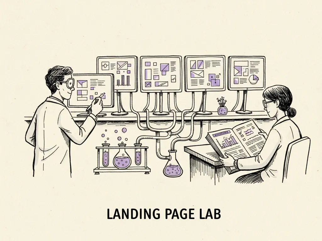
A landing page is a standalone web page designed for one specific goal, usually to convert visitors arriving from a particular ad, email, or search result into a lead or a sale. Unlike a homepage, which has to serve many different visitor intents at once, a landing page can and should be ruthlessly focused on a single promise and a single action. Most landing pages underperform not because of weak design, but because they try to do too much, or because they don't match what the visitor was told before they clicked.
Match the page to the promise
Message match (whether a landing page's headline and content reflect the exact promise made in the ad or search result that brought the visitor there) is one of the most overlooked factors in conversion. If a search ad promises '20% off your first order' and the landing page opens with a generic brand headline and no mention of the discount, visitors feel the click was misleading, even if the discount exists somewhere on the site, and many will leave immediately.
Before writing any landing page copy, write down the exact words used in the ad, email subject line, or search snippet that will send traffic to this page. The landing page headline should echo that promise directly, ideally within the first few words a visitor reads.
| Mismatched page | Matched page | |
|---|---|---|
| Ad promise | 'Free 15-minute audit for your Google Ads account' | 'Free 15-minute audit for your Google Ads account' |
| Landing headline | 'Welcome to [Agency Name]' | 'Get Your Free 15-Minute Google Ads Audit' |
| Visitor reaction | Unsure if this is the right page, hesitates | Confirms they're in the right place, continues reading |
| Typical effect | Higher bounce, lower conversion | Lower bounce, higher conversion |
One clear benefit, backed by proof
Above the fold (the content visible before scrolling) should communicate one clear benefit to the visitor, not a list of five features. The benefit answers 'what do I get and why does it matter to me,' not 'what does this company do.' Immediately after or alongside the benefit, include one credible form of proof appropriate to the business and honest about what's actually available: a specific example of the process, a demonstration, documented methodology, or a genuine customer review if one exists. Never fabricate testimonials, review counts, or client results to fill this space; an honest page with modest proof outperforms a page that gets caught overstating itself.
Choose one main action
Every landing page should have exactly one primary call-to-action, repeated at logical points down the page, rather than multiple competing actions like 'Buy Now,' 'Download Our Guide,' and 'Follow Us on Instagram' all presented with equal weight. Secondary links (like a privacy policy or a way back to the main site) can exist in small, de-emphasized text, but the main action should be visually dominant and unambiguous.
- 1Headline that echoes the exact ad or search promise
- 2One clear benefit statement and one form of honest proof
- 3The single primary call-to-action, visible without scrolling if possible
- 4Supporting detail: how it works, what's included, who it's for
- 5Objection handling: pricing clarity, guarantees, FAQs addressing hesitations
- 6Repeat the primary call-to-action at the bottom of the page
Reducing friction without losing necessary information
Form friction is the effort and hesitation a form creates for the person filling it in: more fields, unclear labels, or unnecessary required information all increase the chance someone abandons the form before submitting. The general principle is to ask only for information you'll actually use in the near term. A simple newsletter signup rarely needs a phone number; a service business booking a sales call, however, may genuinely need qualifying information (budget range, timeline, company size) to avoid wasting both parties' time, so removing those fields just shifts friction to a worse later conversation.
A useful test for any form field: can you name the specific way this field will be used in the next communication with this lead? If not, consider removing it or making it optional.
Accessibility, speed, and objections
A landing page that loads slowly or is hard to use on mobile loses visitors before the message even has a chance to land; page speed and mobile usability are foundational, not optional extras. Accessibility (making the page usable for people with visual, motor, or cognitive differences, for example through sufficient color contrast, readable font sizes, and forms that work with screen readers) also widens who can actually convert on the page and is worth checking with basic accessibility tools before launch.
Objection-handling content, such as a short FAQ section addressing pricing, guarantees, or common hesitations, should sit after the main pitch but before the final call-to-action, since visitors who scroll that far are engaged but not yet convinced.
Measurement
Track conversion rate (the share of visitors completing the main action), form abandonment (visitors who start but don't finish the form), and page load speed together. A fast page with a mismatched message, or a well-matched page that loads slowly on mobile, will both underperform; treating these as one connected review avoids chasing the wrong fix.
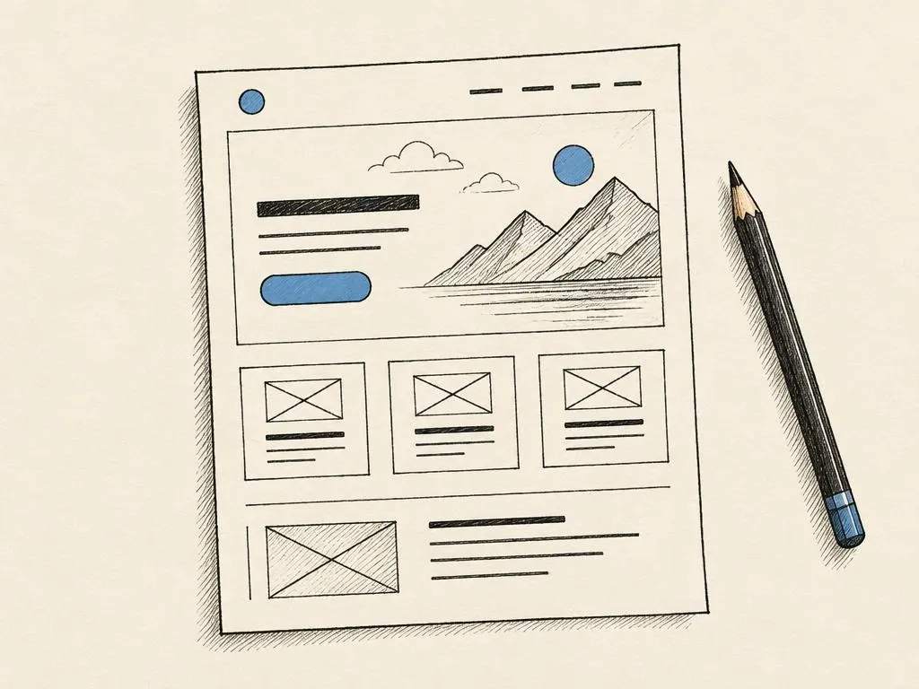
Annotated wireframe and before/after review
Use the following review template to audit an existing landing page or plan a new one.
- Headline matches the exact promise in the referring ad or search result
- One clear benefit and one honest, real form of proof are visible early
- Exactly one primary call-to-action, repeated but not competing with others
- Every form field has a clear, near-term use; unnecessary fields removed or optional
- Page passes a basic mobile and accessibility check (contrast, tap targets, screen reader labels)
- Objection-handling content (FAQ, guarantee, pricing clarity) sits before the final call-to-action
- Page load speed tested on mobile, not just desktop
Common mistakes
- Sending ad traffic to a general homepage instead of a page matching the specific ad promise.
- Listing many features and benefits instead of focusing on the one that matters most to this specific visitor.
- Including multiple competing calls-to-action that split attention and reduce conversion.
- Removing form fields that are genuinely needed for qualification, creating a worse experience later in the sales process.
- Launching a page without testing load speed and usability on mobile devices.
When this is not the right tactic
A dedicated landing page is not necessary for every campaign. For a very small, low-stakes test (such as an early validation ad sending traffic to gauge interest in a new idea), a simple existing page or even a well-crafted social post with a direct link may be enough before investing in a custom page. Dedicated landing pages matter most when traffic volume or spend is high enough that conversion rate differences meaningfully affect results, or when the promise is specific enough that a generic page would clearly mismatch it.