Retention is the metric most growth teams agree matters most and measure worst. A single 'retention rate' number hides enormous variation: a 30-day retention rate can mean 'logged in once' or 'placed a second order' depending on who calculated it, and a company-wide average can mask one segment retaining excellently while another churns almost entirely. This article covers how to build cohort retention analysis that produces decisions, not just dashboards.
What a cohort is and why the starting point matters
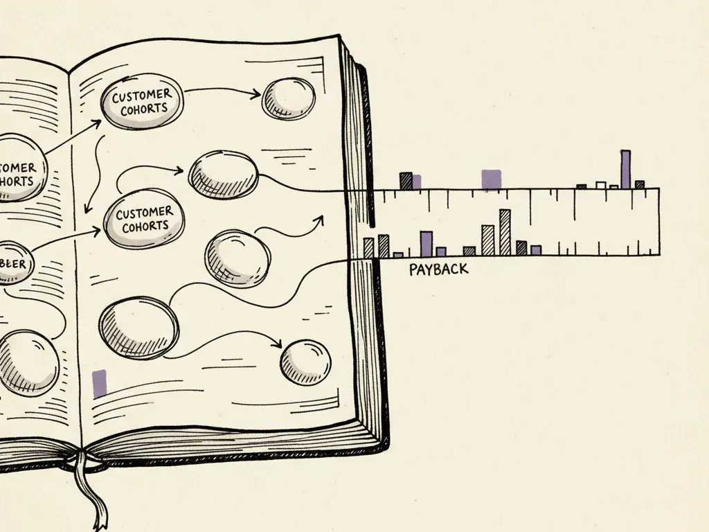
A cohort is a group of customers who share a starting event, most often the month they signed up or made their first purchase. You then track what percentage of each cohort is still active (by whatever definition fits your business) at each subsequent time interval: week 1, week 4, month 3, and so on. Comparing cohorts over time, rather than looking at one blended retention curve, reveals whether retention is improving or worsening for newer customers, which a single average cannot show.
The choice of starting event matters. Signup date works for free-trial software. First purchase date works better for ecommerce, since many signups never buy. For subscription businesses, first billed period is usually more decision-relevant than account creation, because it reflects people who have actually committed.
- 1Choose a starting event that matches a real commitment (signup, first purchase, first paid period)
- 2Choose a retention definition appropriate to the business model (engagement vs. revenue)
- 3Group customers into cohorts by the month or week of their starting event
- 4Track the percentage of each cohort retained at matched time intervals
- 5Compare cohorts against each other, and check for confounders before concluding a cause
Engagement retention vs. revenue retention
Engagement retention tracks whether customers are still using the product or service: logging in, opening an app, visiting a site. Revenue retention tracks whether they are still paying, and at what level, including expansion (paying more, for example upgrading a plan) and contraction (paying less, for example downgrading). These two metrics often diverge. A free tool might have strong engagement retention but weak revenue retention if few users ever convert to paid. A subscription business might have moderate logo retention (percentage of accounts still subscribed) but strong net revenue retention if the accounts that stay tend to expand their spend.
| Metric | What it measures | Risk if used alone |
|---|---|---|
| Engagement retention | Still logging in or using the product | Can look healthy while revenue quietly shrinks |
| Logo retention | Percentage of paying accounts still active | Treats a $50/month and $50,000/month account the same |
| Net revenue retention | Revenue from a cohort over time, including expansion and contraction | Can look healthy if driven by a few large accounts expanding |
From cohorts to actionable lifecycle segments
Once you can see retention curves, the next step is identifying lifecycle segments: groups defined by where a customer sits in their relationship with the business, based on observed behavior rather than assumed demographics. Common lifecycle stages include new (first interval), activated (completed a defined key action), engaged/repeat, at-risk (usage or purchase frequency dropping versus their own history), and lapsed (inactive beyond a defined window). The key design decision is setting the at-risk threshold using the customer's own historical pattern, not a single company-wide cutoff, since a weekly buyer going quiet for two weeks is a different signal than a quarterly buyer doing the same.
Estimating profitable interventions
Not every retention problem deserves the same investment. Prioritize candidate interventions by multiplying the estimated size of the addressable segment by a plausible, conservative retention lift, then compare that against the cost of the intervention (an email flow, a customer success outreach, a product change). A small, cheap intervention reaching a large at-risk segment can outperform an expensive, bespoke intervention reaching very few customers.
Confounders that fake a retention trend
A declining or improving cohort retention curve is often blamed on the product or the retention team, when the real driver is upstream. Common confounders include a shift in acquisition channel mix (a new paid channel bringing in lower-intent customers who were always going to retain worse, regardless of the product), seasonality (cohorts acquired just before a holiday peak may look different from off-season cohorts), pricing or promotion changes (a discount-driven cohort may retain worse once the discount ends), and onboarding changes that happened mid-period. Before concluding that a retention change is caused by a specific internal decision, check whether the acquisition mix, pricing, or external seasonality shifted at the same time.
A deliverable: cohort table and intervention-priority matrix
A working retention analysis should produce two concrete outputs: a cohort table (shown below as a simplified hypothetical) and a ranked intervention-priority matrix.
| Cohort (signup month) | Month 1 retained | Month 3 retained | Month 6 retained |
|---|---|---|---|
| January (hypothetical) | 68% | 41% | 29% |
| February (hypothetical) | 71% | 44% | 31% |
| March (hypothetical) | 64% | 36% | — |
In this hypothetical table, March's weaker month-1 and month-3 retention compared with January and February would prompt a check for confounders, for example whether March's signups came disproportionately from a new paid channel, before concluding the product got worse for that cohort.
- Segment name and the behavioral definition used to identify it
- Estimated segment size (number of customers currently in it)
- Average revenue or value per customer in the segment
- Conservative estimated retention lift from the proposed intervention
- Estimated cost to build and run the intervention
- Resulting priority: estimated retained value vs. cost, ranked against other candidate interventions
Illustrative values only; not a benchmark for any real business and excludes revenue or margin differences between channels.
Common mistakes
- Reporting one company-wide retention number and missing large divergence between segments or cohorts.
- Mixing engagement and revenue retention into a single number, hiding whether paying customers are actually staying.
- Setting a single at-risk threshold for all customers regardless of their normal usage frequency.
- Concluding a retention change was caused by a product decision without checking acquisition mix, pricing, or seasonality.
- Prioritizing the loudest internally discussed segment instead of the one with the largest estimated reachable value.
- Comparing cohorts at mismatched time intervals (e.g., a 3-month-old cohort against a 9-month-old cohort's month-9 figure).
When this is not the right tactic
Cohort retention analysis needs a meaningful volume of repeat behavior to be statistically useful; a brand new product with only a handful of customers per monthly cohort will produce noisy, unreliable curves, and qualitative customer interviews may teach more at that stage. It is also less useful for one-time-purchase businesses with no expected repeat behavior (certain high-ticket, infrequent purchases), where customer satisfaction and referral metrics may be more relevant than a retention curve. Finally, if your data cannot reliably distinguish customers across time (for example, no login or account identifier), you may need to invest in better identity tracking before cohort analysis is possible at all.